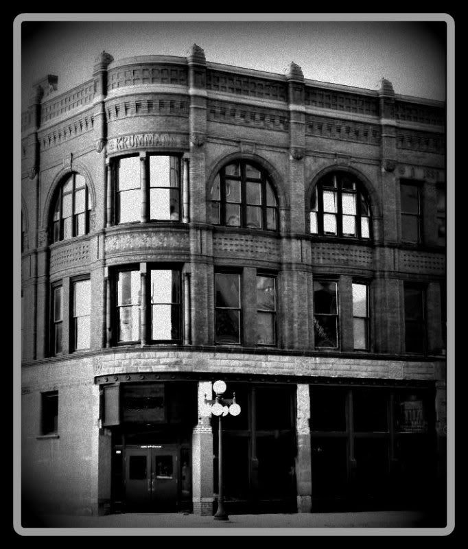
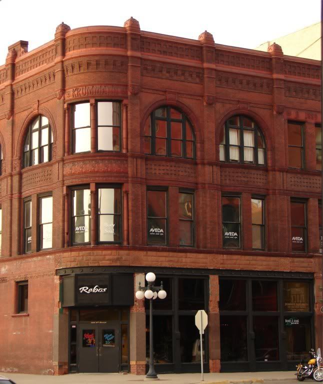
 This old building from the 1800's didn't need much to bring out the age to it. I had to get rid of some signs in the window, a stop sign in front and the Harley parked by the side. I enhanced the colors and contrast and adjusted the lighting so the bricks and details would stick out some and then converted it to black and white. A touch of film grain to add age and cover a little of the erased marks blurs and to give the sky some effect as it was completely white when converted to black and white.
For more Monochrome Monday shots click on the link and play along.

I decided to add the original photo to show the things I needed to eliminate for the above shot. I wanted the old building to look as old as it is and all the signs plus modern transportation took away from it.


13 comments:
I think some people in the 'antique' trade might call it 'stressing' the image.
You worked hard on it.
It's a lot of effort to put in, but the end result is impressive. Was the vignetting the way you covered your tracks, or is that just for added effect? It works either way.
Nice job!
I leave the technical stuff to the gents .. I think its a wonderful bldg and a good shot .. makes me wonder who would live there .. what would their life be like
Beautiful shot and work on the lovely old building.
Beautiful shot, and great photoshopping. Such a wonderful building, it really lends itself to monochrome.
Wow. You really made it look "old". Great job and what a fantastic building both in BW and color! Love it. Greetings from San Ramon.
I'm very impressed by the work you put into getting the monochrome image. But it was worth it -- the monochrome image is fantastic.
You did a great job ! The B/W photo is very beautiful !
Have a nice week !
brilliant piece of work!
It's a very interesting building...I like its lines and decorative touches. Truthfully, I like the color shot better, but I don't do the Monochrome Monday meme :-)
That building looks great in b&w!
so basically what you are saying is that you did a ton of work on this pic to make it look like it does now.
I have read all the comment's and would agree with most. The B/W is successful in making the photo look genuine. I love history, so it transports me back to a time when people and life had unique meaning. I think the modern building is a color that I find attractive. I believe if we do not preserve the past, we become lost. mark
Post a Comment